A coordinate system where infinity is a place you can plot.
The Hyperdimensional Coordinate System (HCS) rebuilds the idea of an axis. Every dimension is the entire real line — including both infinities — wrapped onto a circle, and dimensions nest inside one another, so four, seven, or twelve of them fit into the three dimensions you can actually look at.
The idea
Two old walls, one construction that goes through both.
Ordinary plots — Cartesian, polar, cylindrical — fail in two ways that show up constantly in dynamical systems and multichannel signal data:
- Divergence. When a value runs off to infinity you truncate, clip, or break the curve. The most interesting part of the behavior is exactly the part the plot throws away.
- Three axes. Beyond three dimensions you must project, slice, or reduce. Something is always discarded, and what got discarded is rarely obvious afterward.
The HCS answers both with a single move, and it answers them together — the same construction that brings ±∞ into the picture is the one that lets dimensions stack without limit.
One dimension
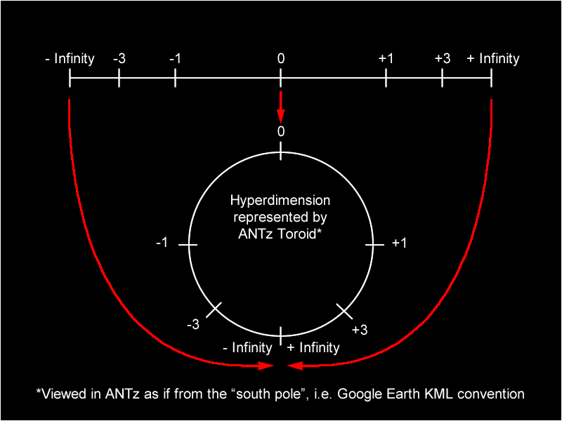
Fold the whole number line into a line segment, then close it into a circle.
Start with a line segment of arbitrary length and let every point along it stand for a number from 0 to infinity. Pick a point; it splits the segment into two subsegments, the one before it and the one after it. The number that point represents is the ratio of those two lengths.
- The exact midpoint splits it 1 : 1, so it represents
1/1 = 1. - Three-quarters along splits it 3 : 1, so it represents
3. - The far end has nothing after it — the ratio grows without bound. That end is infinity.
So the first half of the segment holds every number from 0 to 1, and the second half holds every number from 1 to infinity. Nothing is left out and nothing runs off the edge. Do the same with the negatives, join the two halves at zero, and you have a finite segment carrying the entire extended real line from −∞ through 0 to +∞.
Then the last step: wrap the segment around a circle so that the two ends meet. Positive infinity and negative infinity become one point. A trajectory that blows up through +∞ doesn't stop — it crosses that point and comes back around from below.
The map, in one line
In Hyperdims that construction is a single formula. A value v becomes an angle
θ in degrees:
s is the scale of the dimension: the value whose magnitude lands at
90°. Zero maps to 0°, ±s to ±90°, and ±∞ both map to 180° — the same point on the circle.
It inverts exactly, which matters more than it sounds: every rendered point can be turned back into the numbers it came from.
What the scale really does
s is not cosmetic — it is the only knob that decides which part of your data gets the room.
Values well under s spread out across the first quarter turn; values well over s
crowd toward the infinity point. Set s near your data's typical magnitude and the structure
opens up; set it far away and everything piles into an arc.
The plotter's auto-scale does this for you per dimension: it takes each column's median
magnitude as that column's s, so the typical value of every column lands at 90° and columns
measured in wildly different units become comparable.
Nesting
The second dimension is a circle standing on the first one.
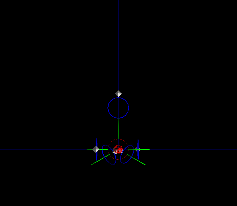
One value picks one point on the circle. To add a dimension, put a smaller circle at that point, turned so it meets the parent circle at a right angle — the cross-section plane of a torus wrapped around the parent ring. The second value picks a point on that smaller circle; the third dimension is a smaller circle still, standing at that point.
Repeat for as many dimensions as the data has. Each row of your table walks down this chain of circles, and the point it arrives at on the last circle is the plotted data point. Its position in 3D space encodes all of its coordinates at once — nothing was projected away, nothing was reduced.
Two consequences are worth spelling out, because they are what make the system practical rather than merely pretty:
- There is no projection step. The nesting is a coordinate transform, not a dimensionality reduction. A 7-dimensional point has one exact 3D location, and you can read all seven of its values back out of it.
- Dimensions cost nothing to draw. In Hyperdims the circles are pure math, not objects in the scene. Ten thousand points in seven dimensions is one instanced draw call — the guide circles you see are drawn only for the one point you are inspecting.
Reading a plot
What you are actually looking at.
The first HCS plot is disorienting, and it helps to know what the shapes mean before you decide whether you like them.
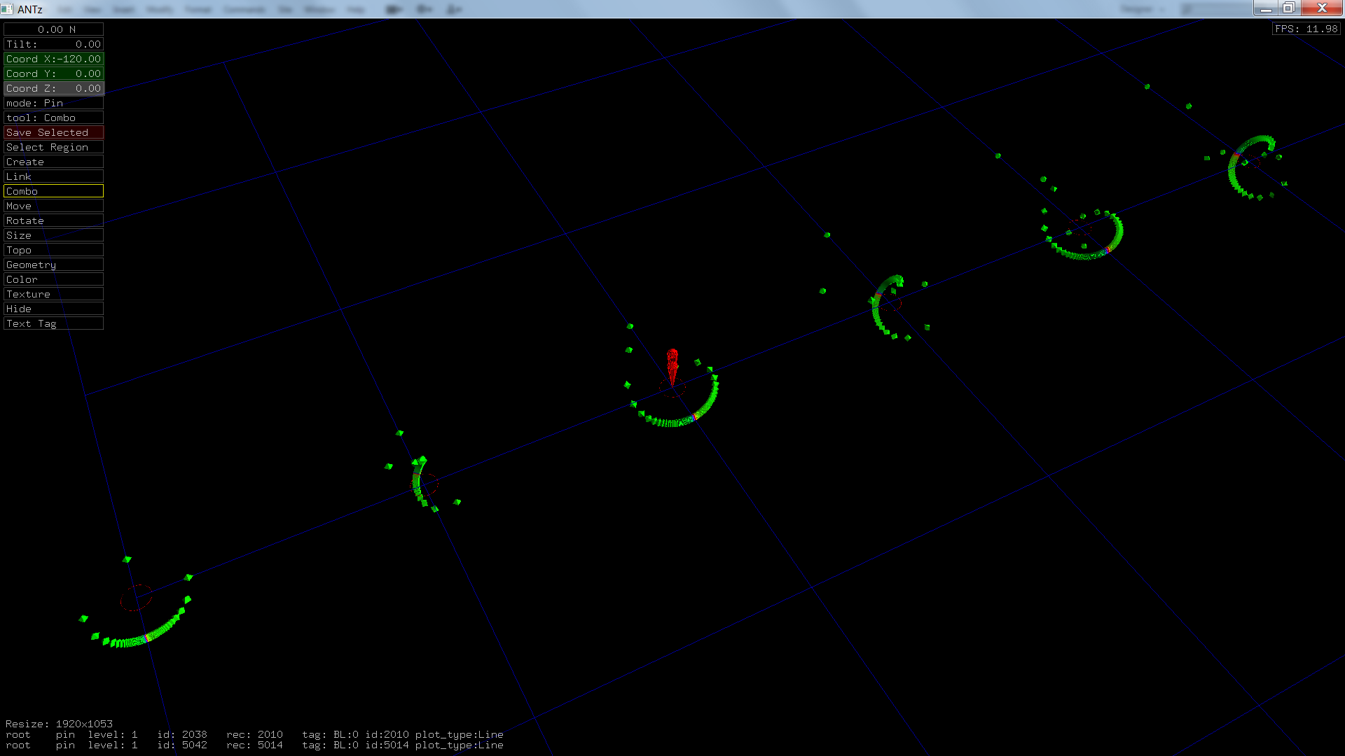
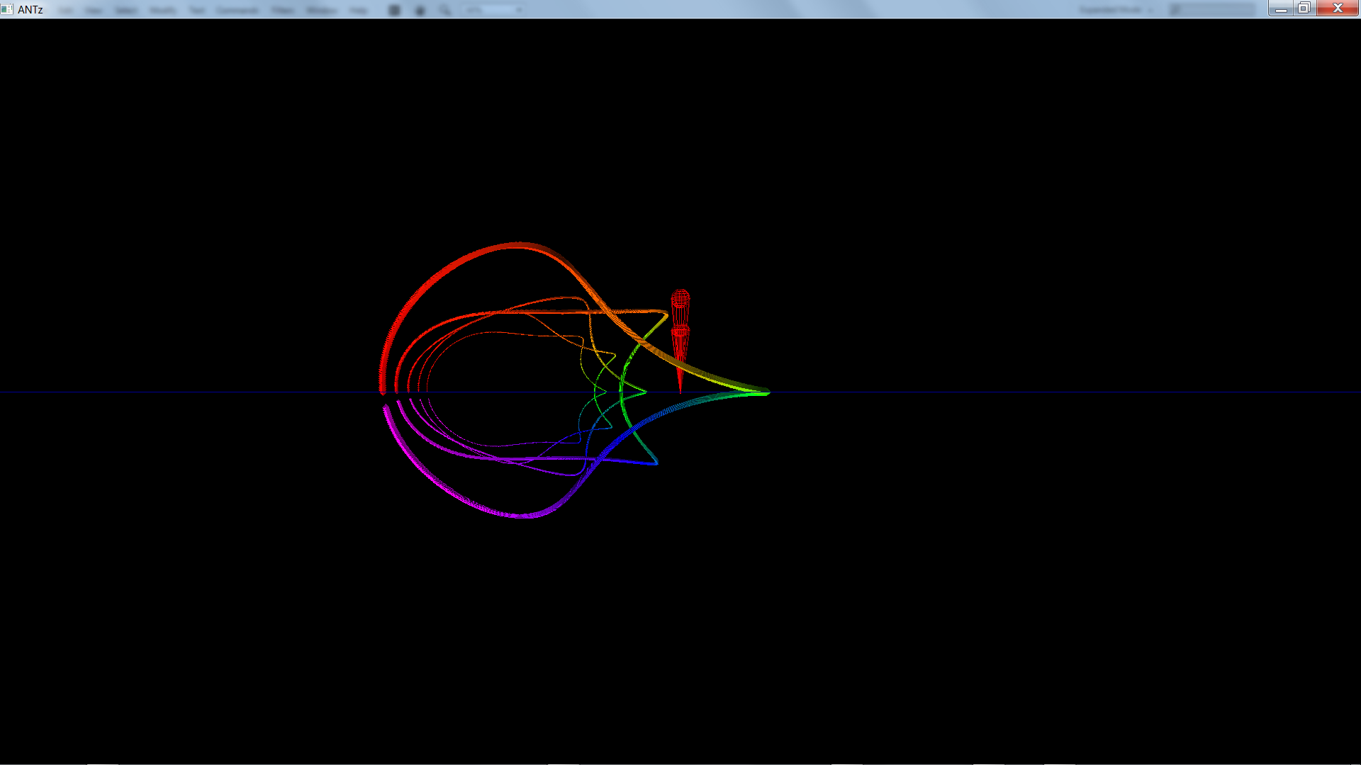
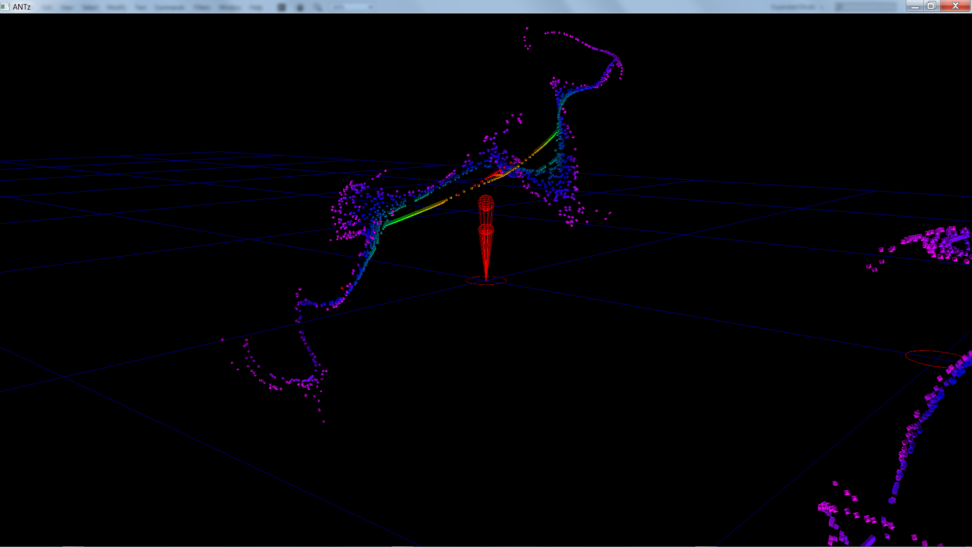
- Every dot is one row of your data — one instant in a time series, one observation, one iterate of a map.
- The line joining them is time. Points are drawn in row order, and coloured across a prismatic spectrum: red early, magenta late. Where the colour changes fast, the system is moving fast.
- The colored guide circles are the dimensions — red, green, blue, cyan, magenta, yellow in order — shown for the one probe point you have selected. Click any point to move them there and see the chain of choices that put it where it is.
-
Hover for the numbers. The tooltip inverts the map and shows every original value
alongside the angle it produced, including
+∞and−∞where they occur. - Structure means structure. Smooth loops, ribbons and folds mean deterministic dynamics. Noise looks like a ball of twine — which is itself a useful, immediate reading.
Getting data in
Any CSV, two ways to read it.
Drop a spreadsheet-style CSV anywhere on the plotter window, or use load CSV file…. There are
two ways to turn a table into dimensions, and the choice matters more than any other setting:
-
columnsmode — each numeric column becomes its own dimension. This is the right mode for genuinely multivariate data: one dimension per EEG electrode, per sensor, per species. -
embedmode — one column is lag-embedded into n dimensions, taking each point as(x(t), x(t−τ), x(t−2τ), …). This is Takens' method from chaos theory, the standard way to reconstruct a system's attractor from a single measured signal. Ordinary phase portraits stop at three dimensions; here they don't have to.
Literal Infinity and -Infinity entries are valid data and plot at 180°. Rows
containing non-numeric junk are skipped rather than fudged.
Six demo datasets are built in, so you can get a feel for the system with no data at all — a straight line from 1 to 100, a sine wave, a tangent sweep through ±∞, the logistic map in chaos, a multivariate Lissajous figure, and the dopamine bifurcation model whose blow-up through infinity started all of this.
Start here
A five-minute path into the tool.
- Open the plotter. It starts on a sine wave in four dimensions.
-
Set
sourceto Tangent (through ±∞) and watch what the curve does at the infinity point. That single view is the whole argument for the system. -
Turn
auto-scaleoff and dragscale (value at 90°). Everything inflates and collapses. This is the intuition for whatscontrols. - Click a point. The colored dimension circles jump to it — that is the nested chain from this page, drawn around your actual data.
-
Set
sourceto Dopamine bifurcation, raisepoints, and hitplayin the Animation folder to watch the orbit ramp into its blow-up.
The panel, briefly
| Control | What it does |
|---|---|
| source | Built-in demo, or CSV once you have loaded a file. |
| points | How many rows to plot. Also how far along a generated demo runs. |
| dimensions | How many nested circles, 1–12. |
| lag (embedding) | τ, the offset between successive coordinates in embed mode. |
| scale (value at 90°) | The s in the mapping formula. |
| auto-scale | Per-dimension s from each column's median magnitude. |
| base radius · radius ratio | Size of the first circle, and how much each nested circle shrinks. Legibility, not mathematics. |
| probe point | Which row the guide circles are drawn for. Clicking a point sets it. |
| 3D stereo (cross-eyed) | Side-by-side stereo pair. Cross your eyes until the halves fuse and the nesting becomes literal depth. |
| export GlyphViz ZIP | Writes the current scene as a GlyphViz/ANTz CSV set, including animation channels that replay the trajectory through its coordinate frames. |
Origins & reading
Where the pieces came from.
The subsegment-ratio construction — the way of putting all of [0, ∞) inside a finite segment — comes from Dr. Art Springer, who presented it in a linear algebra course at San Diego State University in 1989, as a way to bring infinity into view. That is where his idea ends.
Everything after it belongs to this project: extending the segment to signed values, and then closing it into a circle so that +∞ and −∞ meet at a single point. That step was seeded by working in ANTz, whose sphere and torus topologies are closed, wrap-around primitives — which made a closed dimension the natural shape to reach for. It is also the step that matters most, because a segment is a way of drawing a number line, while a circle is something that can nest. The orthogonal hierarchical nesting that turns one such circle into arbitrarily many dimensions follows from it, and is this project's as well.
The implementation lineage runs through ANTz — an immersive visualization environment whose nested-toroid topology and parent–child branching made the first HCS plots possible — and its successor GlyphViz, which Hyperdims still exports to. The browser plotter re-derives the geometry as pure mathematics, which is why it can render ten thousand points across seven dimensions at interactive rates rather than building eighty thousand scene objects.
Related work
Ruiz Estrada, M. A. (2009). The Multi-Dimensional (MD) Coordinate Systems. FEA Working Paper No. 2010-05. SSRN 1427568 · doi:10.2139/ssrn.1427568
Flexa, C., Gomes, W., Moreira, I., Alves, R., & Sales, C. (2021). Polygonal Coordinate System: Visualizing high-dimensional data using geometric DR, and a deterministic version of t-SNE. Expert Systems with Applications, 175, 114741. doi:10.1016/j.eswa.2021.114741
The lag-embedding used in embed mode is the standard delay-coordinate reconstruction from
nonlinear time-series analysis, the same machinery used to estimate correlation (fractal) dimension.