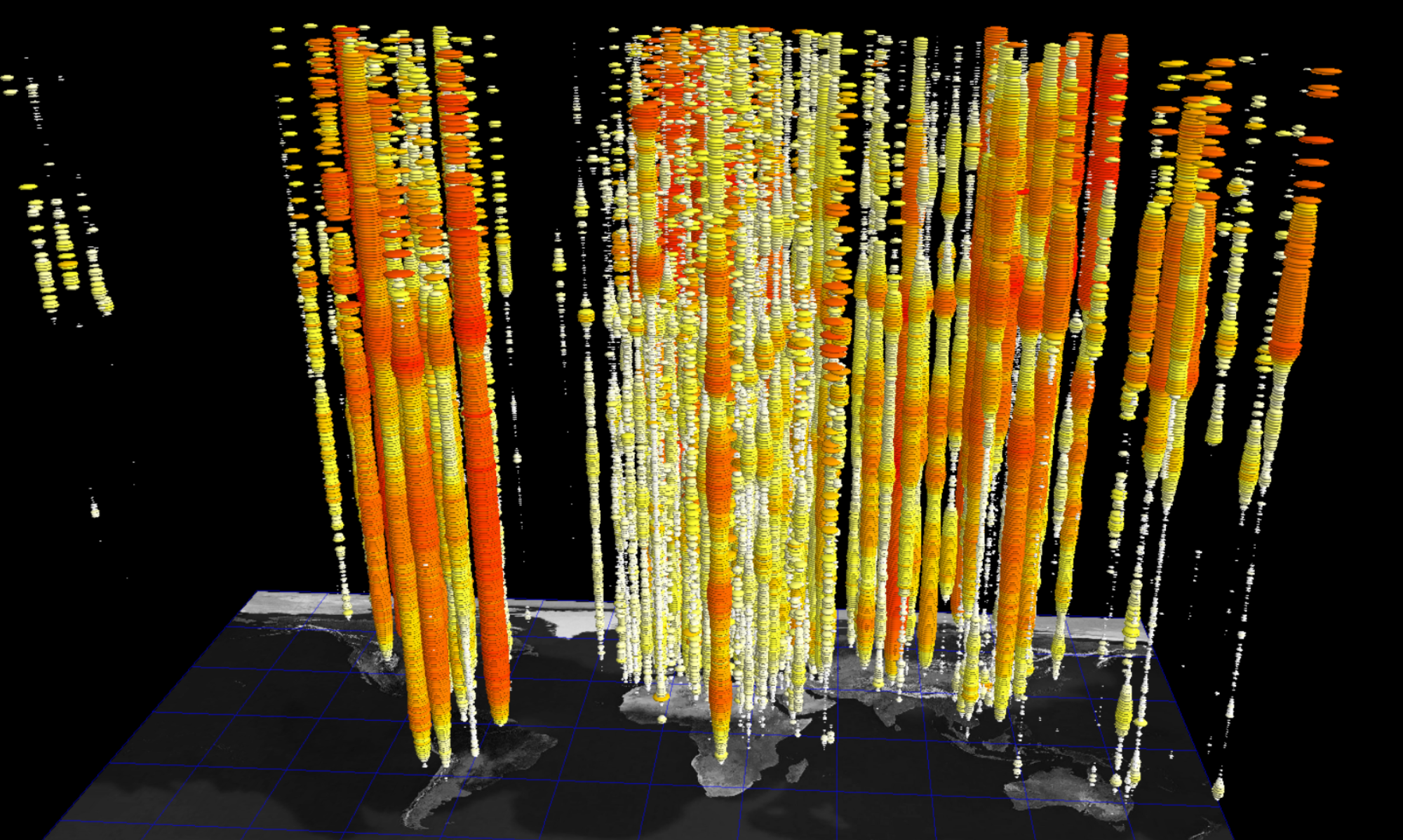
About the Visualization Methods
These are a repertoire of data visualization methods applied to a dataset of tweets containing the hashtag ‘climatechange’ collected during a period from November 20 to December 5, 2018. Methods include a network graph visualization of the entire dataset, frequency count plots of the top 20 tweets (i.e. the tweets with the most retweets), temporal scatter plots showing the lifespan of a tweet with scatter dot size representing follower counts which help shed light on how a user with a high number of followers can ‘resurrect’ the life of a tweet, and 3D data visualization of the same methods combined into a single interactive viz using the ANTz 3D data viz program.
View more visualizations here.


About the #climatechange dataset
This dataset was collected from November 20 to December 5, 2018, with the Twitter API using the streaming search option to gather tweets and retweets which used the hashtag #climatechange. There are 457,294 tweets and retweets. There are 138,305 original tweets and 318,989 retweets.