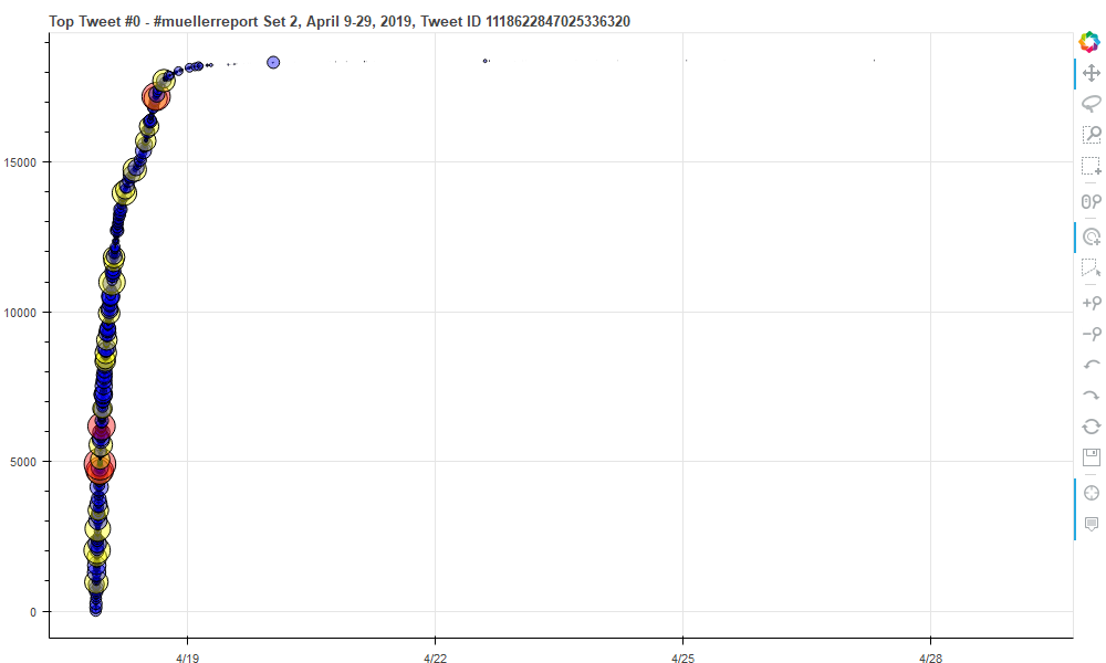
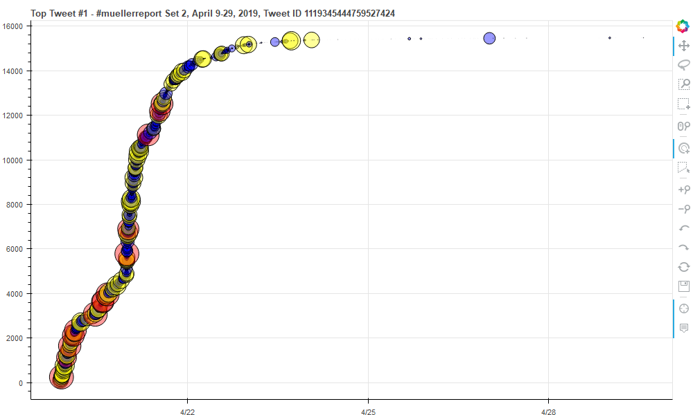
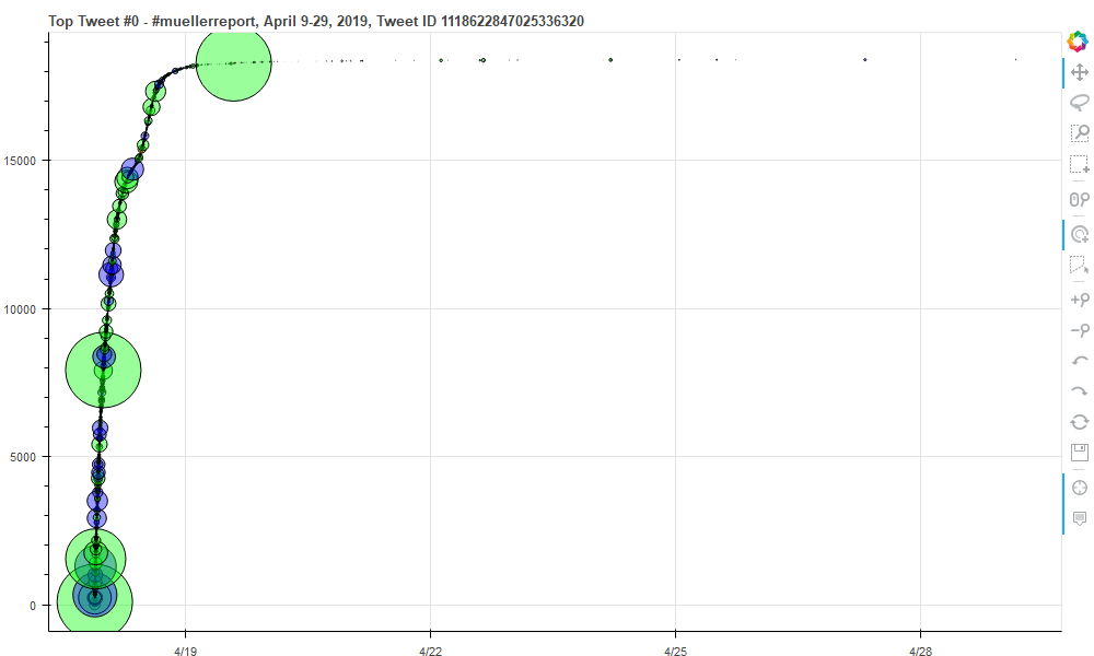
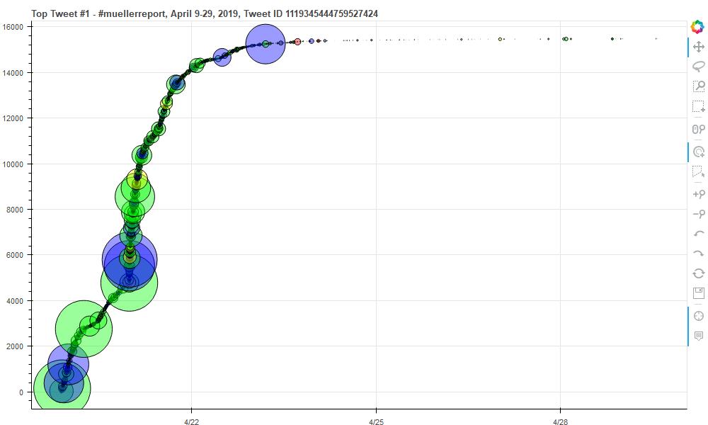
We used Bokeh to visualize 'cumulative' tweet behavior for individual tweets and their associated retweets. We colored and scaled the dots based on bot score. The x-axis is tweet/retweet creation date and the y-axis is simply the incremental count of each tweet. With bokeh you can pan and zoom and hover over the circles for more detains about the tweet including the suser screen name, tweet text, etc.
View some examples.
The images below scale the dot by follower count. This reveals how a Twitter account with many followers can significantly impact the lifetime of the tweet. In the second plot, the sharp turn upwards on April 20 at 11:35pm is caused by a retweet from Donald Trump who had nearly 6 million followers at the time.


