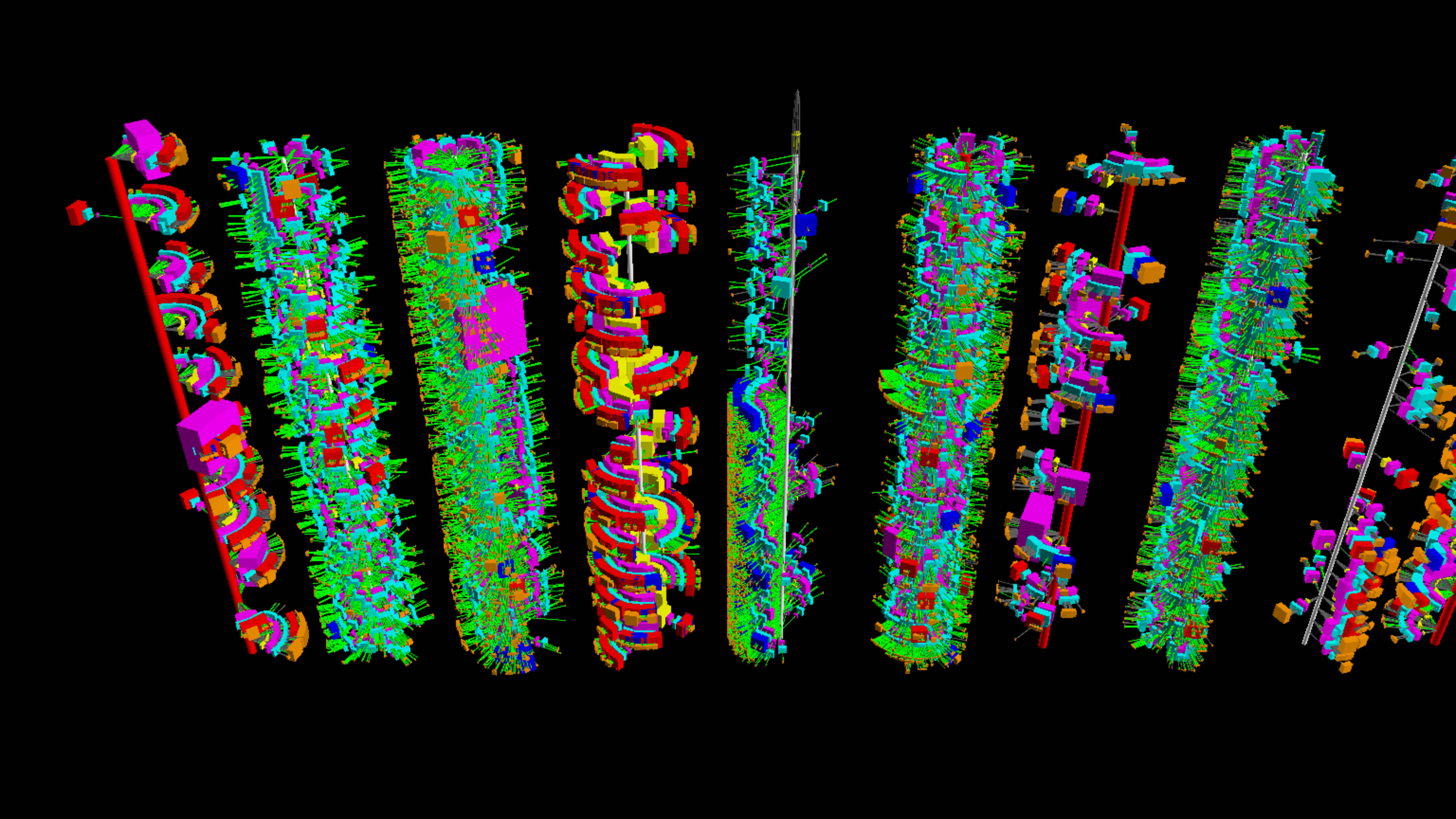
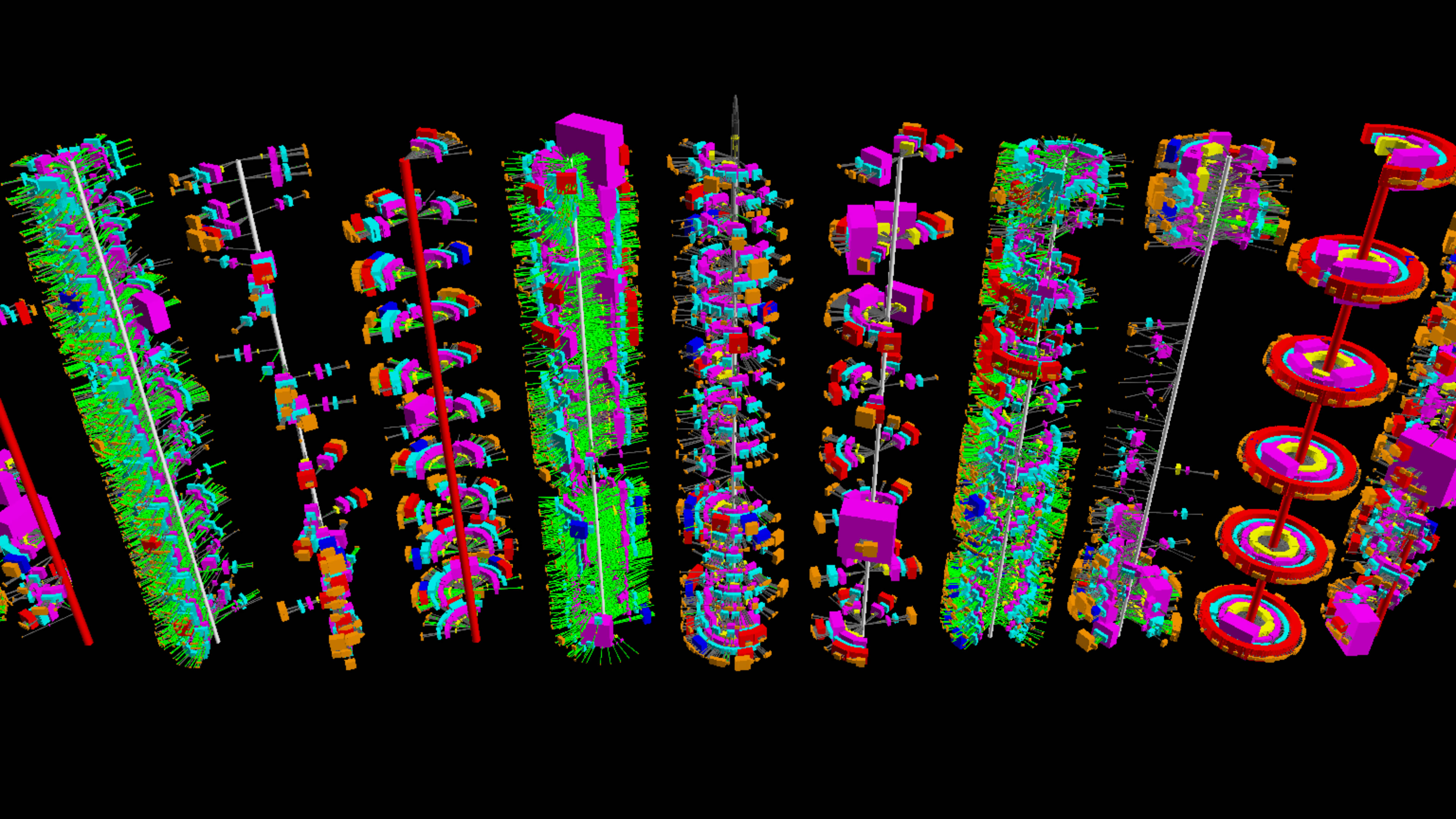
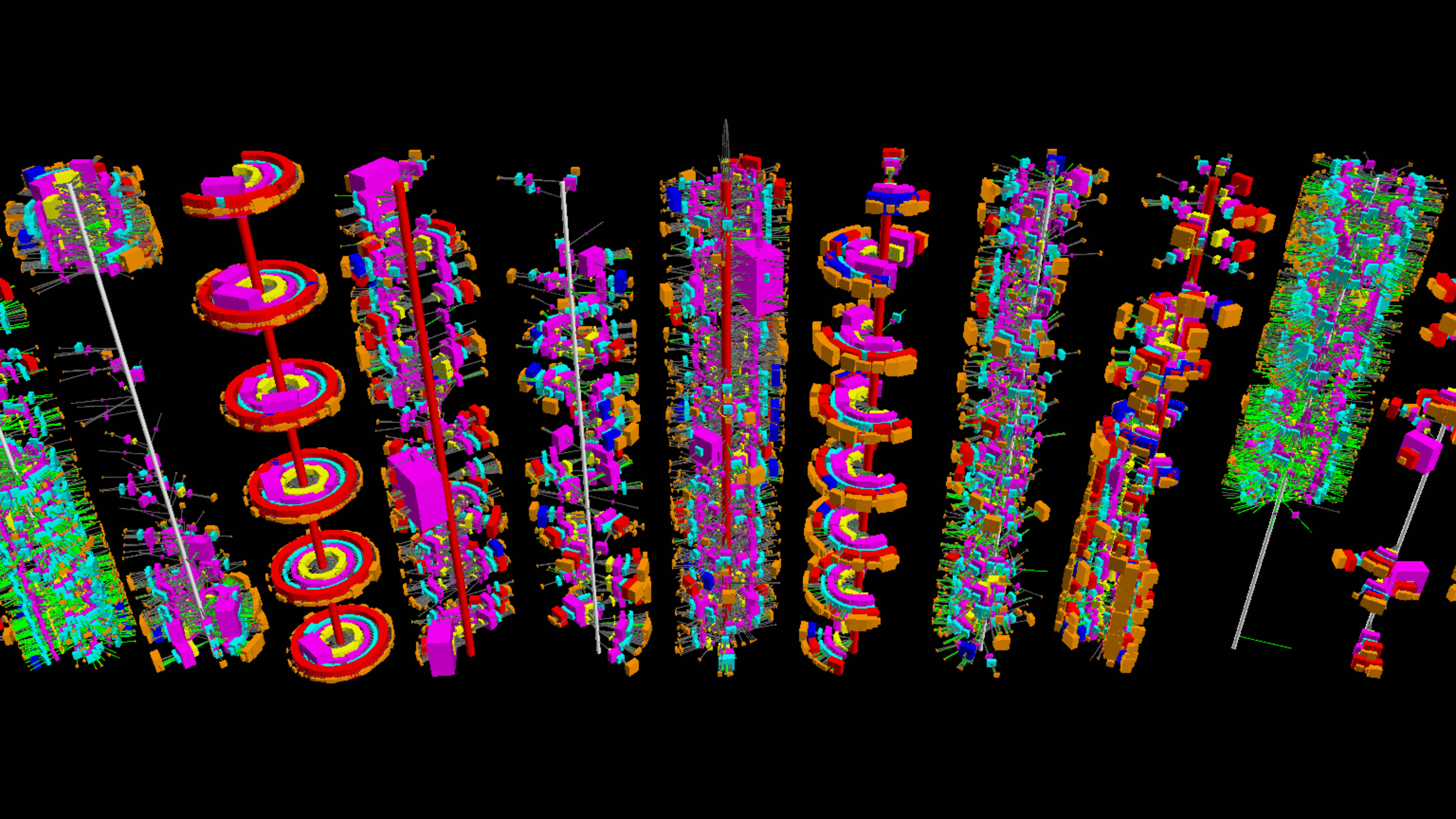
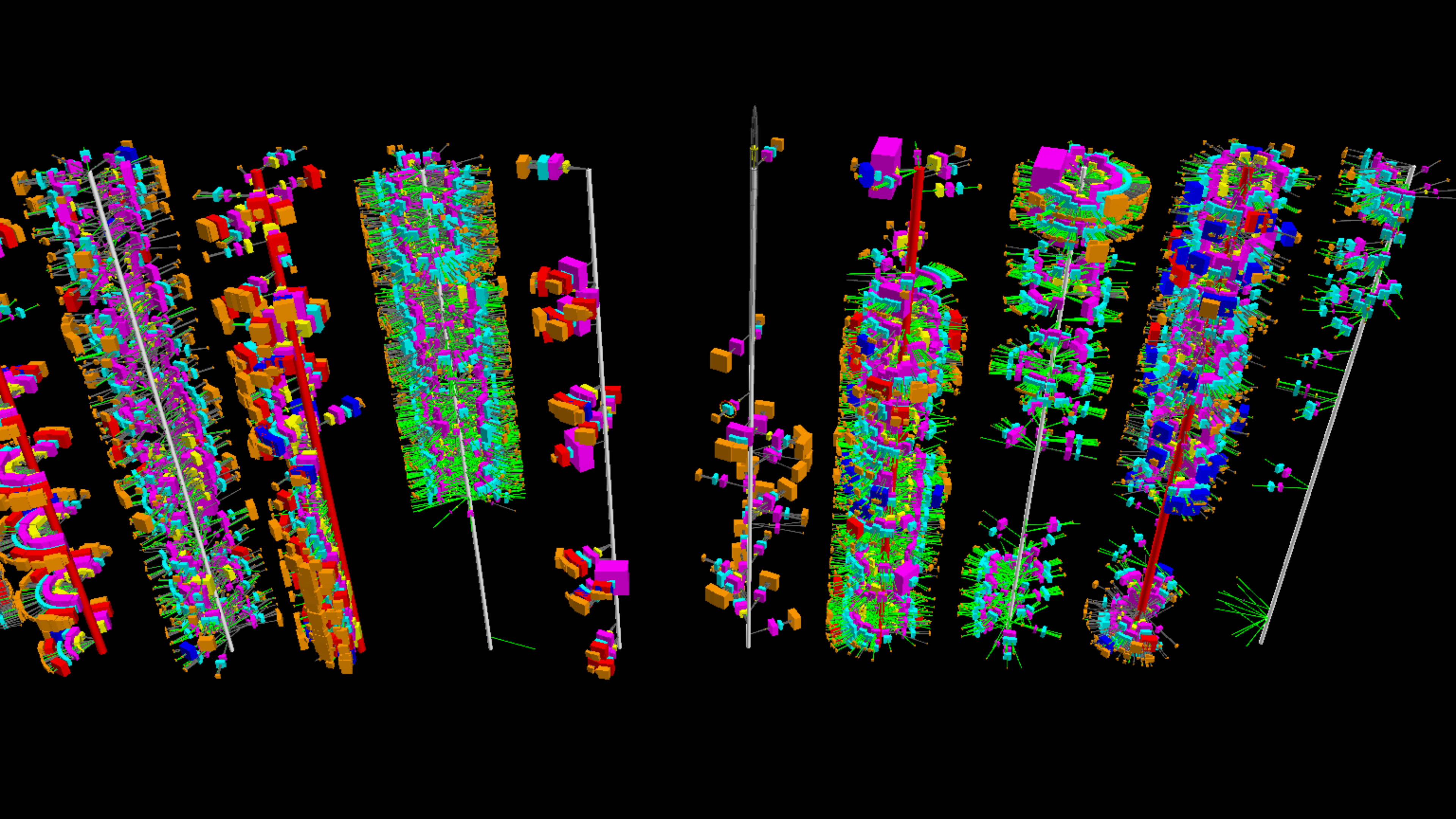
Twitter User Tweet 'Timeline Towers'
Visualization and Sonification
Initial Glyph Design
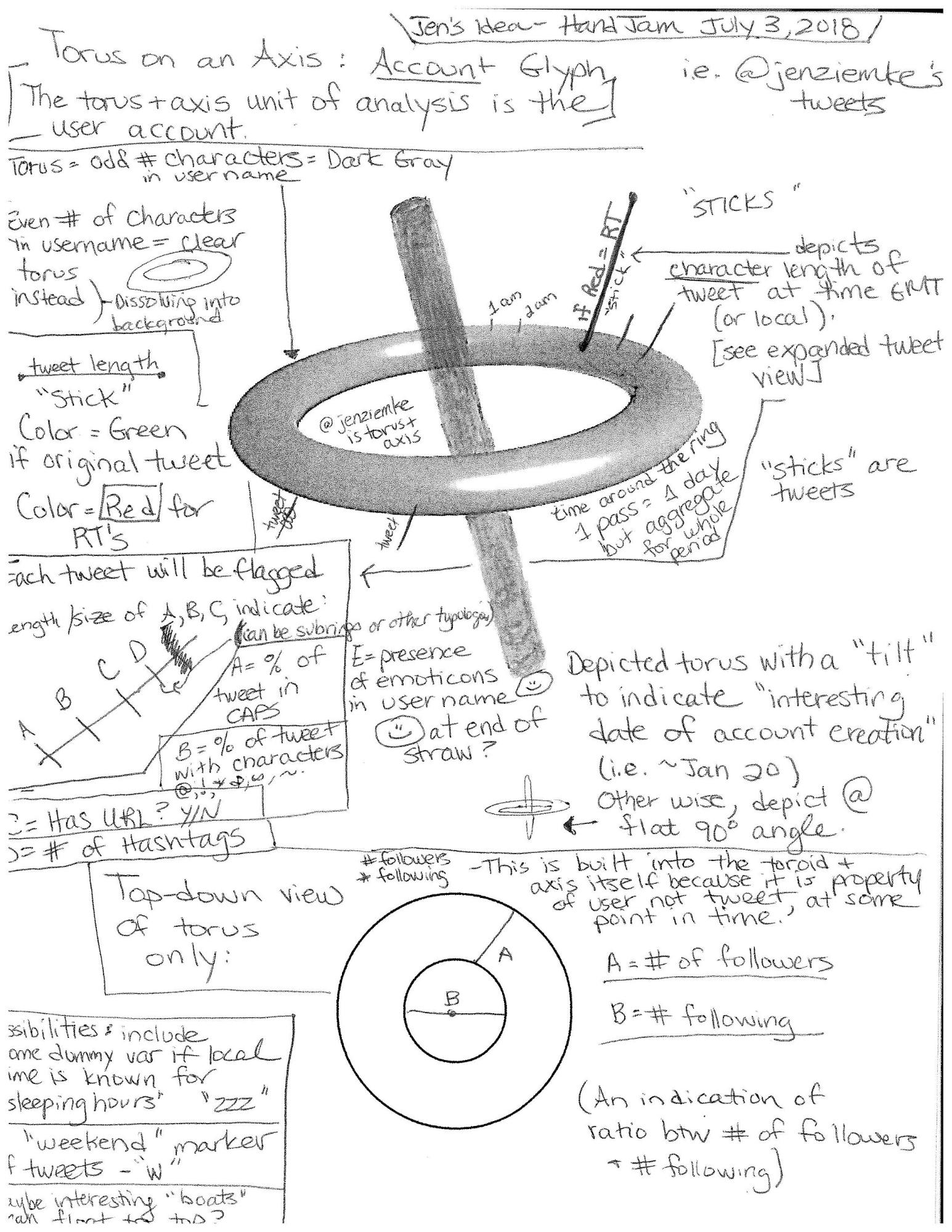
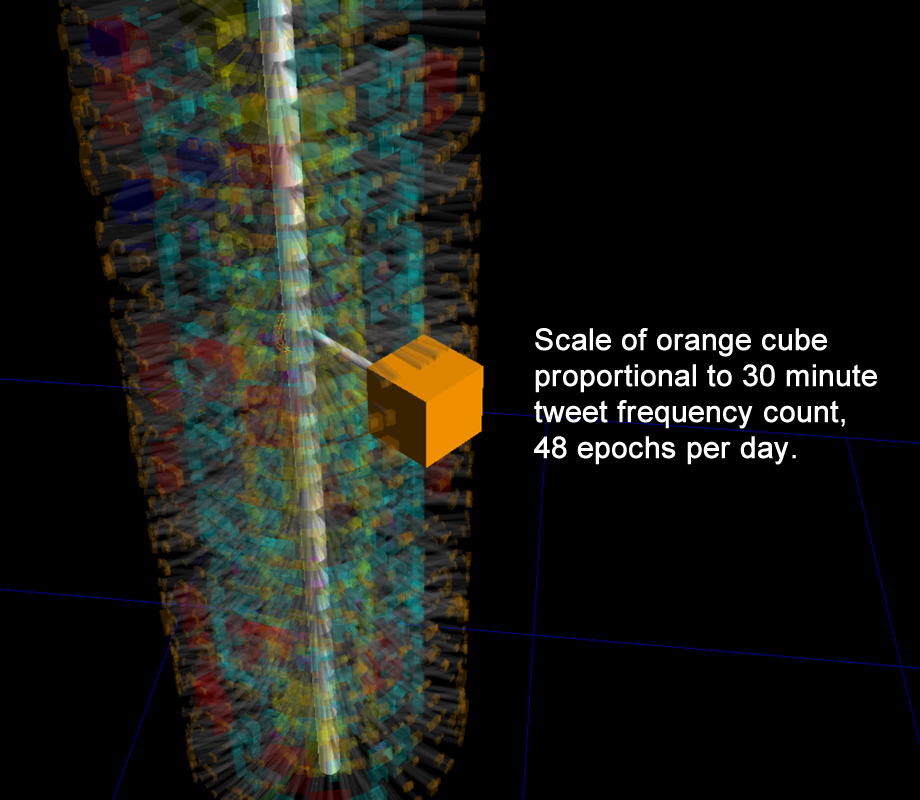
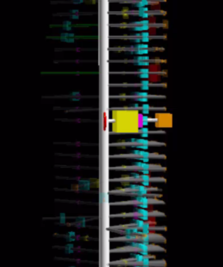
Twitter timeline towers visualize the entire 3200 most recent tweets of a specific user's Twitter activity using an approach which resembles a stack of spoked wheels, each wheel being the user's daily tweet/retweet activity.
The original concept for the daily glyph was conceived by Dr. Jenn Zeimke and her initial design is shown below:
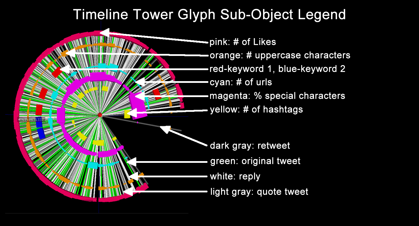
This design was extended in a few different ways. Spokes were used to represent individual tweets, and color-coded to distinguish between an original tweet (green), a quote tweet (light gray), a reply tweet (white), and a retweet (dark gray). Objects were distributed along the spoke to represent various other features of interest. The resulting design for a user's daily tweet/retweet activity is shown below (click to enlarge):
For an active Twitter user, the daily glyph can resemble a bicycle wheel. The spokes of the wheel correspond to individual tweets. Original tweets are colored green are and retweets are gray (in other visualizations we may have colored the spokes based on time zone). Distributed along each spoke from inside to out are cube geometries whose scales correspond to various tweet parameters as shown in the image on the left above. This user's activity consisted of both original tweets and retweets beginning around noon, GMT, and lasting past midnight. This tweet activity is typical of a real person somewhere in North America.
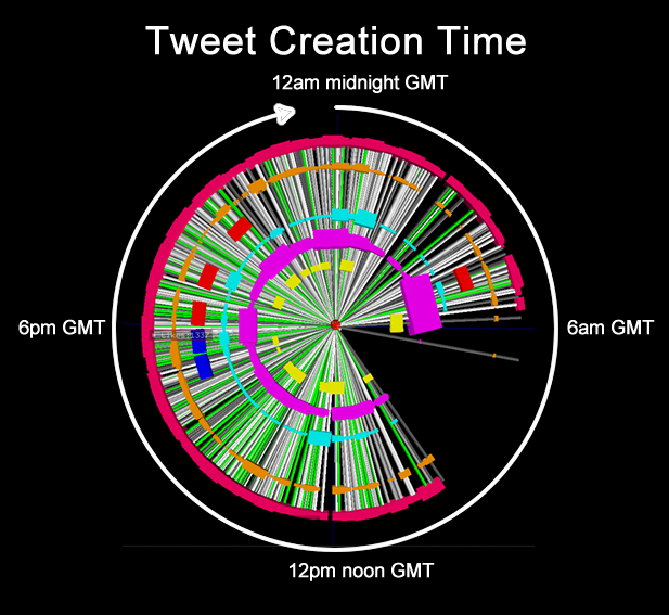
Tweets are distributed circularly in time in a clockwise direction with midnight at the top and noon at the bottom as shown in the image on the right above. This particular user, OpenChanEu, tweeted regularly through the 24 hour cycle, thus having a high likelihood of bot-like behavior.
View some examples of this visualization method with the #trumpcolluded dataset and the #lyincomey dataset.
User Tweet Timeline Towers
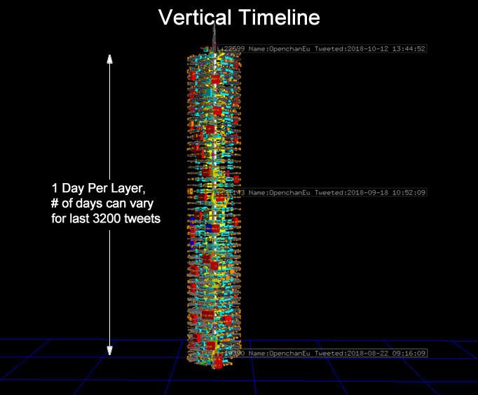
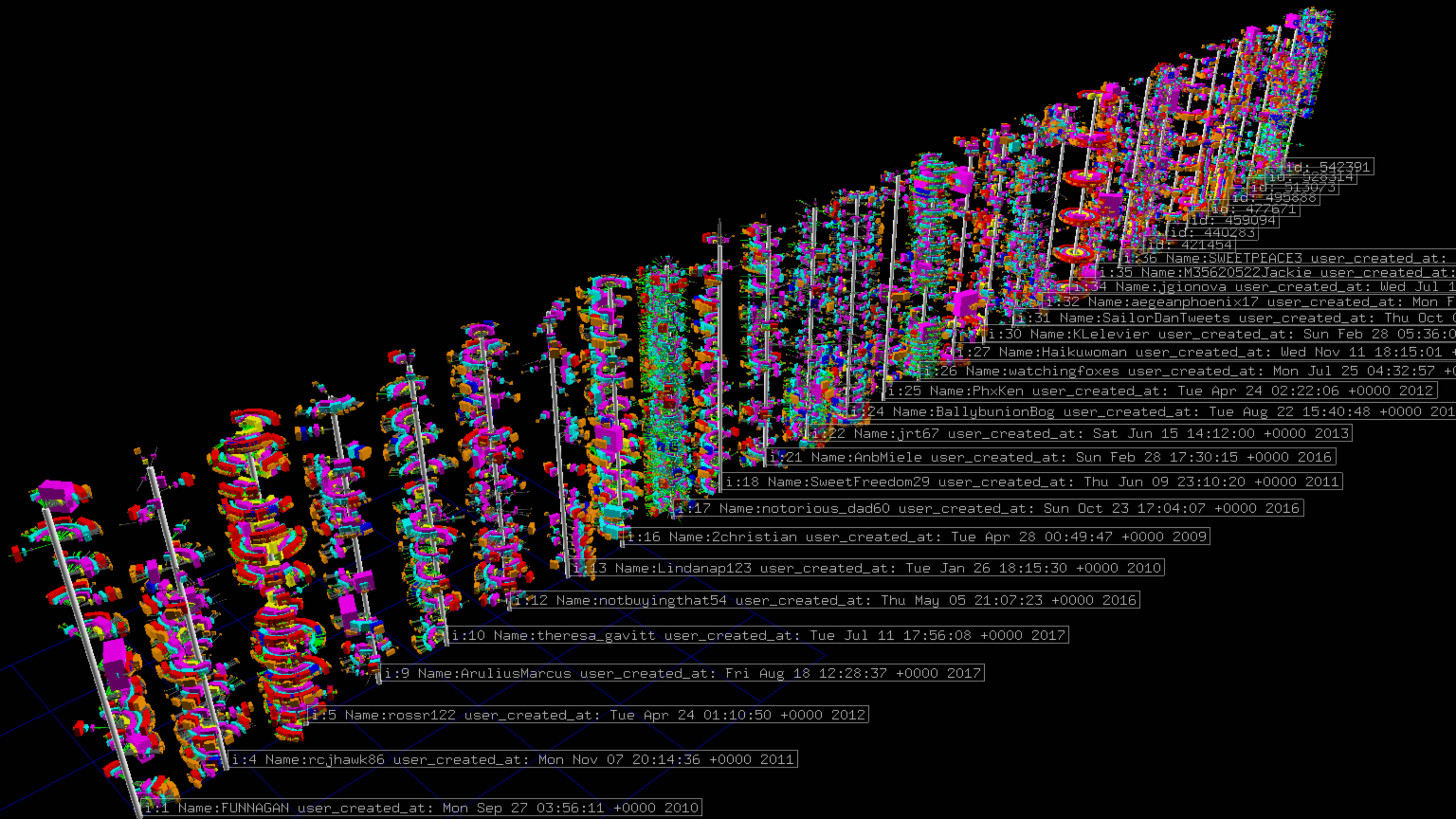
Finally, the glyph was extended to form a tower-like distribution. Objects were distributed in a ‘stacked wheel' type of a layout with earlier dates at the bottom, and each layer consisting of one day's worth of tweets as shown below:
A Twitter user's daily tweet/retweet activity can vary widely from one person to another, particularly if the account is a bot. Some user's tweet/retweet a few dozen tweets each day resulting in a timeline tower consisting of a dense stack of daily tweet glyphs. Others tweet hundreds of tweets in a day, resulting in just a few daily tweet glyphs in the stack.
Twitter Timeline Towers: Bot vs. Not a Bot
Download the hyperglyph visualization for Windows. Hit the 1 key to load "not a bot" and hit the 2 key to load "bot". It's alot of data. I'm thinking about how to improve interactivity and frame rate.
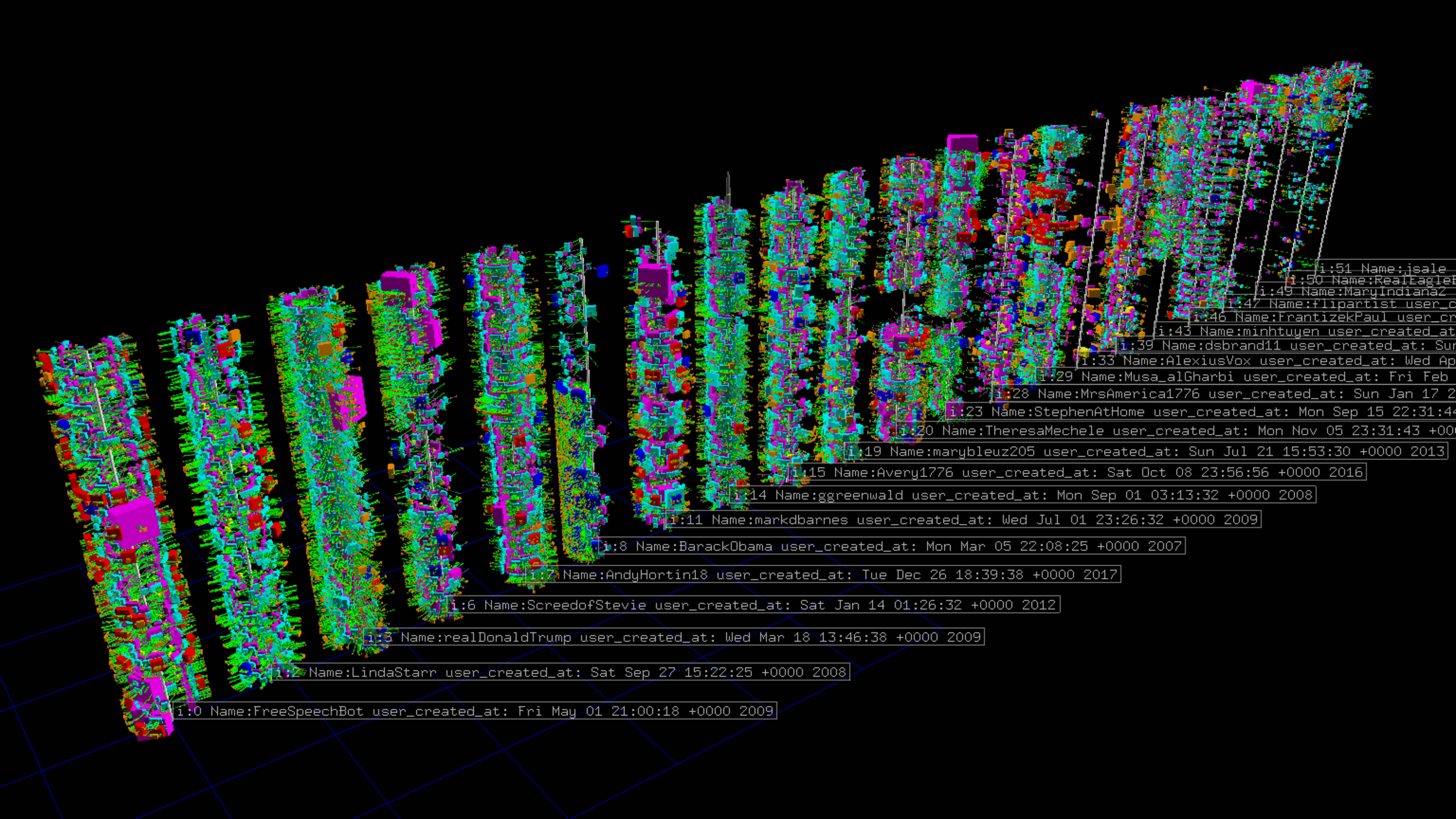
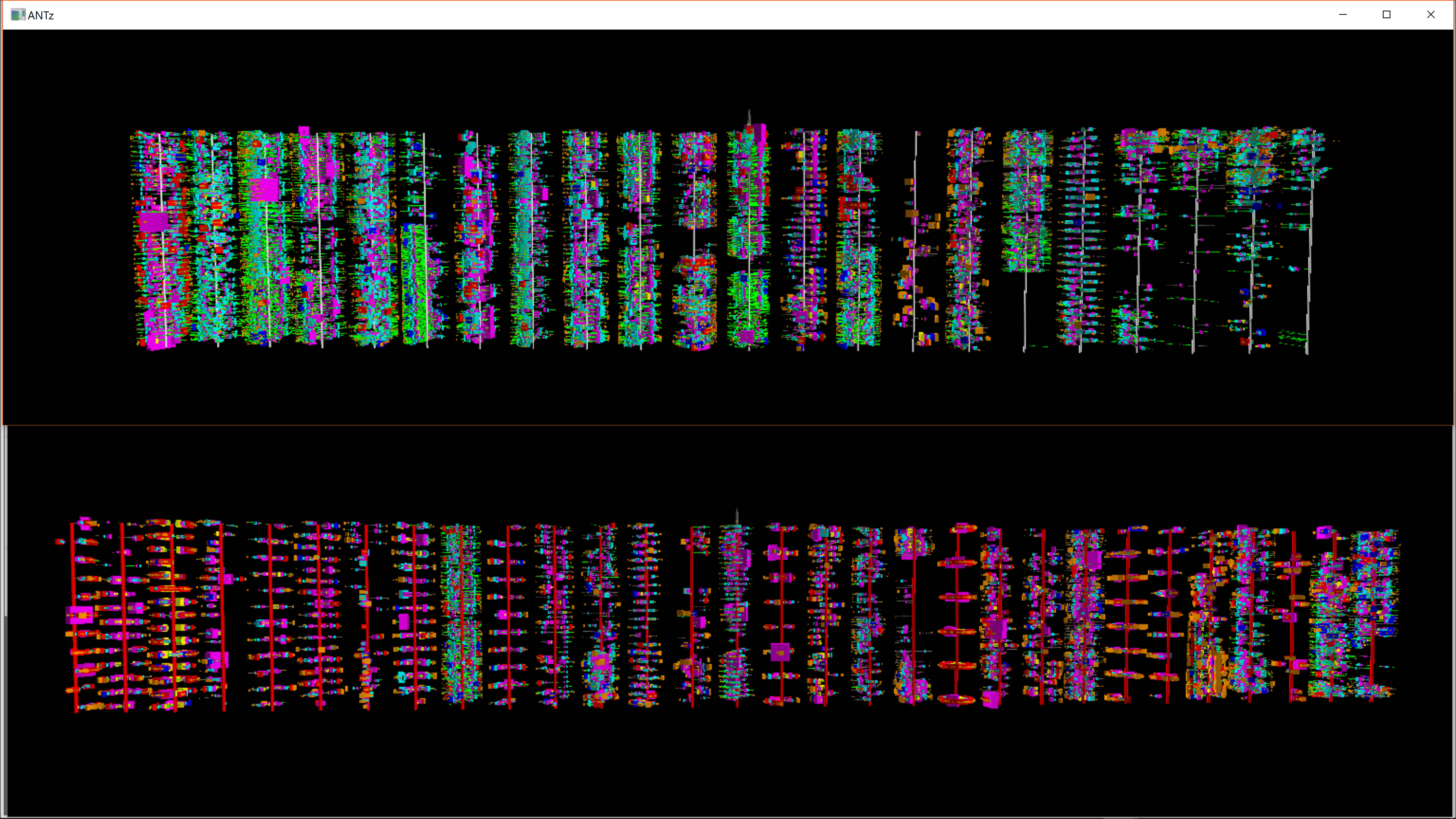
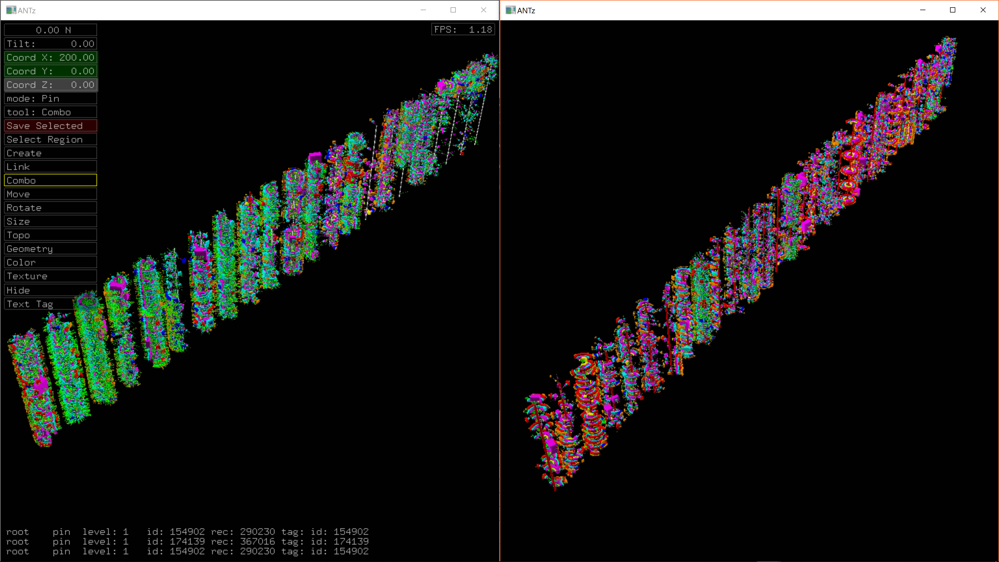
By stacking each day's activity we can see significant differences between users. Our goal with these towers was to find ways of visually distinguishing between Twitter bots and not-bots. Our initial exploration has been very encouraging.
The images on the left below contains timeline towers for users who are flagged by BotCheckMe as showing potential bot behavior. The towers in the image on the right are not.
More images...
"Music Box" Visualization with Sonification
About the Dataset
We started by identifying users from the idlib dataset as having a high probability of bot-like behavior based on Botometer and Botcheckme. Since we first identified these users, some are no longer identified as having bot-like behavior by Botcheckme.
We selected the following users because they all had nearly 3200 tweets. The number of days within the 3200 tweets varied widely as shown:
AirForceWorld: 383
Anithroslan: 266
Chinamaofang: 60
Libertad717: 3
Lz1983: 172
Nelu711: 312
OpenchanEu: 51
Rahim_2025: 133
Soleil82639: 50
About the Animation
Our original plan was to use audio to represent not only the tweet behavior but also some of the features of the tweet included in the visualization. This proved more difficult than we hoped so we initially simplified the audio and visual animation to represent just the tweet count, as shown on the left below. After getting this to work, we extended the code to include audio for each of the five parameters distributed along the tweet ‘spoke', as shown on the right below.
One of the challenges we faced in synchronizing the audio with video is the fact that ANTz playback rate is “as fast as possible” which in the case of these animations was roughly 10 rows per second. This means that if we were to create an animation for each second of time, this would require 18,400 rows to playback and would be hours long. This meant we had to reduce the number of frames (rows) to something more manageable, especially given that some of the user tweet data occurred across many days. As a result, some animations were still very long while others were quite short.
You can download and playback the ANTz animations here:
https://drive.google.com/open?id=1HOasvUpuLfS63bwigXbrrsrGgyZVE7Z0
About the Audio
Full-timeline Playback
We used a simple sine wave of a single frequency and varied the amplitude in proportion to the 30 minute tweet count. Each 30 minute tweet count corresponds to a 128 sample epoch. 48 of these were concatenated to form a day's worth of tweet count audio, and the days were concatenated to form a complete audio file.
https://drive.google.com/open?id=1nSWVCMwGx7pon5cFeNNAjkeSKe4gUNpy
Single Day Daily Average Playback
We also generated audio which would be representative of the audio for an actual ‘music box', i.e a daily summation and averaging. These can be found in the following folder, they are the files which include “single_day” in the name.
https://drive.google.com/open?id=1nSWVCMwGx7pon5cFeNNAjkeSKe4gUNpy
You can also view time series plots of the audio here:
https://drive.google.com/open?id=1c_hUdvKZirCJQzV7NpVEWv4spo3gIgll
Merging of Visualization and Audio
The final step was to combine the visualization with the audio. The screencast was a different length than the audio so We used a feature in Camtasia to change the clip speed of the video to synchronize “close enough” with the audio. Below is an example for the user soleil82639. This user had a very distinct repetitive daily tweet behavior, more so than the other users, resulting in a very periodic audio pattern. This ‘soniviz' is linked below.
https://drive.google.com/open?id=1cLGKdNIq_Y1dflnMjschNXQ8532Oey_e
