Visualizing and Sonifying Bot vs. Not a Bot With Botometer
Botometer, formerly Bot or Not, provides a free way to collect data on a Twitter user's tendency towards "compete automation".
Botometer API Documentation - https://market.mashape.com/OSoMe/botometer
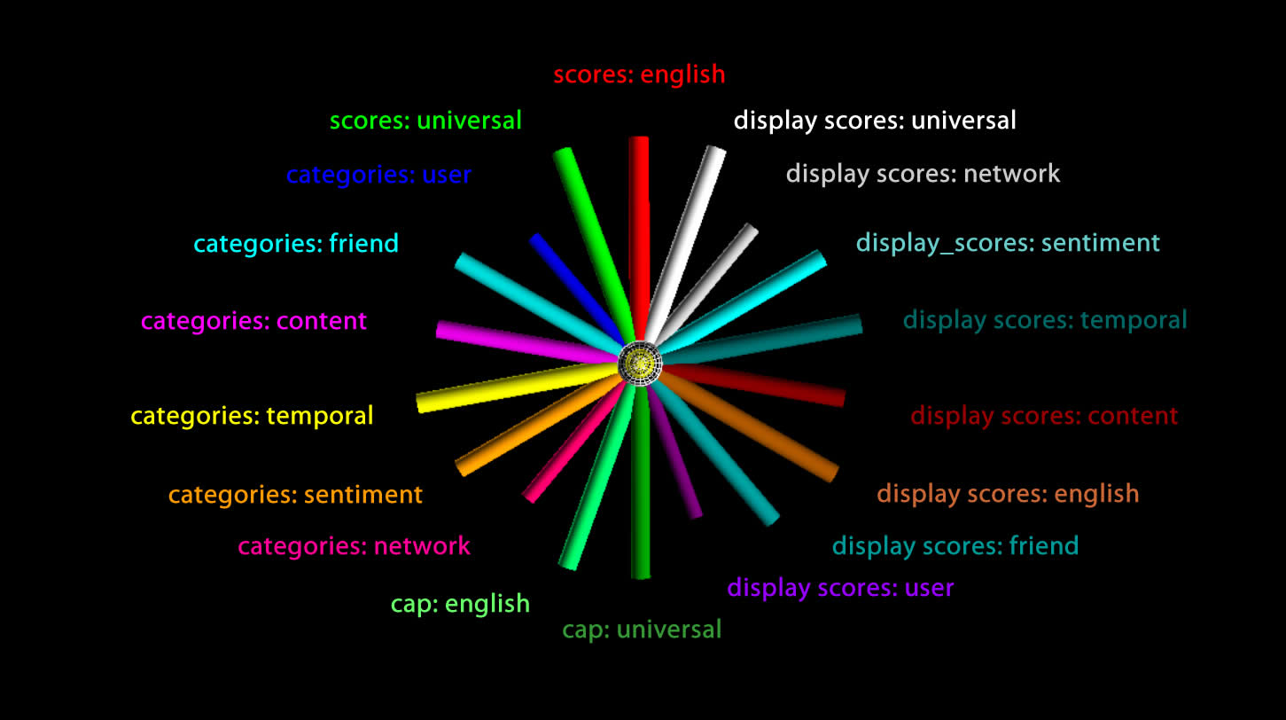
Here's an example of a Twitter user's botometer scores in json:
{
  "cap": {
    "english": 0.0011785984309163565,
    "universal": 0.0016912294273666159
  },
  "categories": {
    "content": 0.058082395351262375,
    "friend": 0.044435259626385865,
    "network": 0.07064549990637549,
    "sentiment": 0.07214003430676995,
    "temporal": 0.07924665710801207,
    "user": 0.027817972609638725
  },
  "display_scores": {
    "content": 0.3,
    "english": 0.1,
    "friend": 0.2,
    "network": 0.4,
    "sentiment": 0.4,
    "temporal": 0.4,
    "universal": 0.1,
    "user": 0.1
  },
  "scores": {
    "english": 0.0215615093045025,
    "universal": 0.0254864249403189
  },
  "user": {
    "id_str": "1548959833",
    "screen_name": "clayadavis"
   }
}
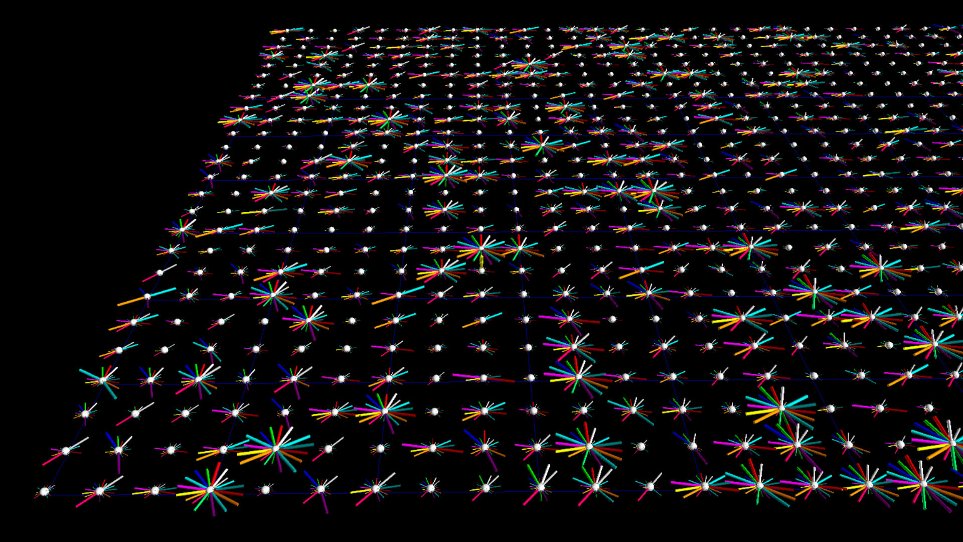
I struggled to find a way to identify a bot based on various thresholds, even though they warn you about this being a rabbit hole. Robert made the brilliant suggestion of simply visualizing all the data for lots of users simultaneously., and here are my first efforts.
Some Categories are Redundant With Display Scores
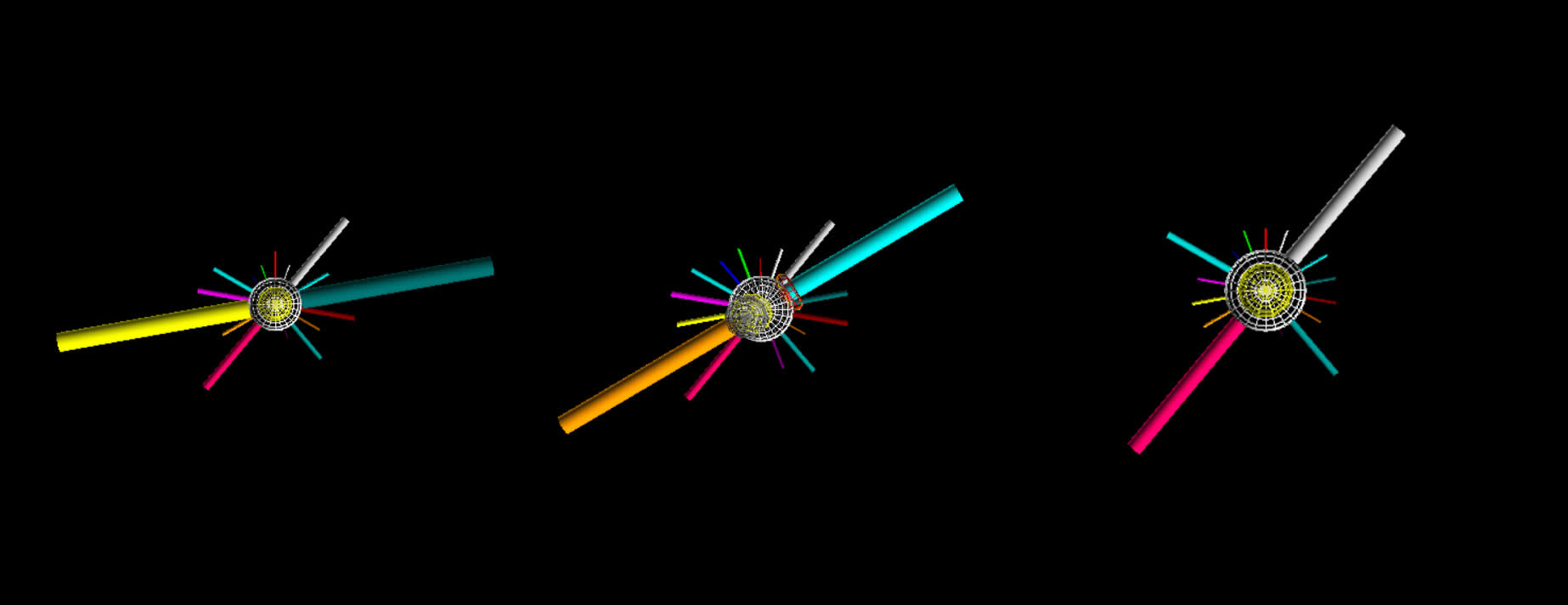
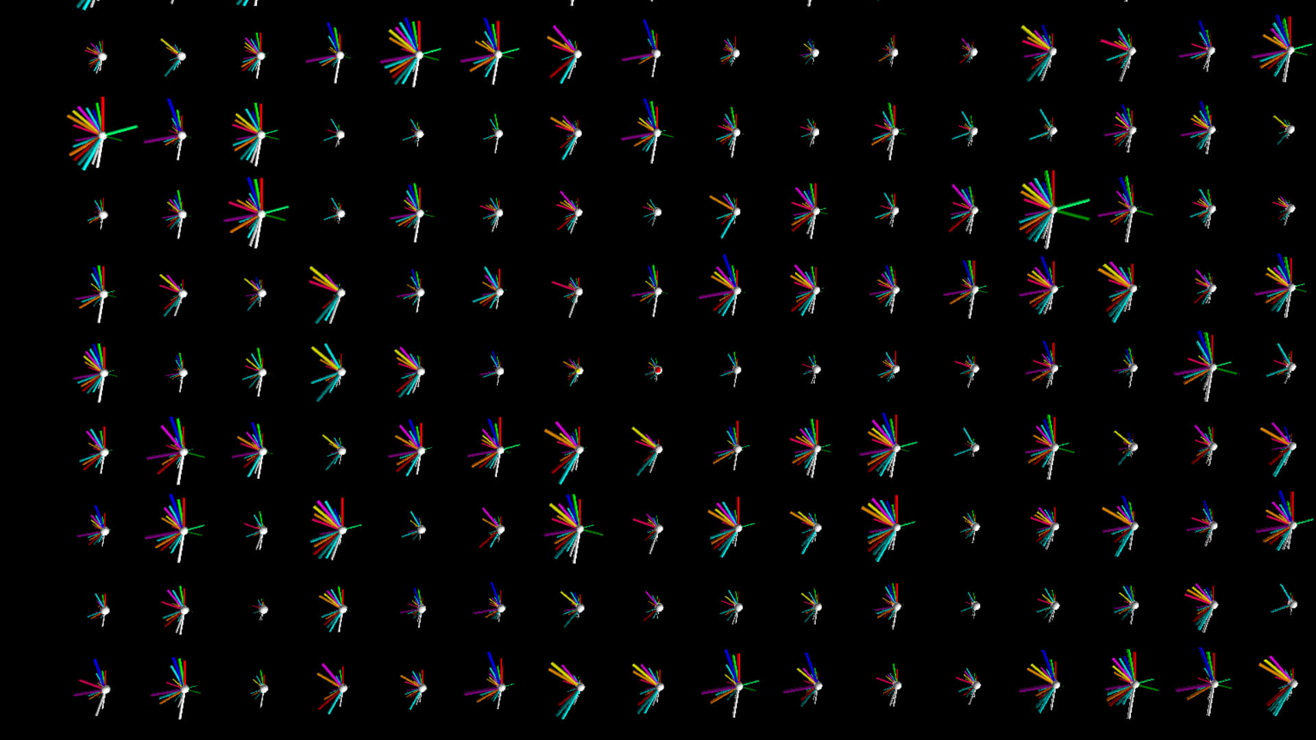
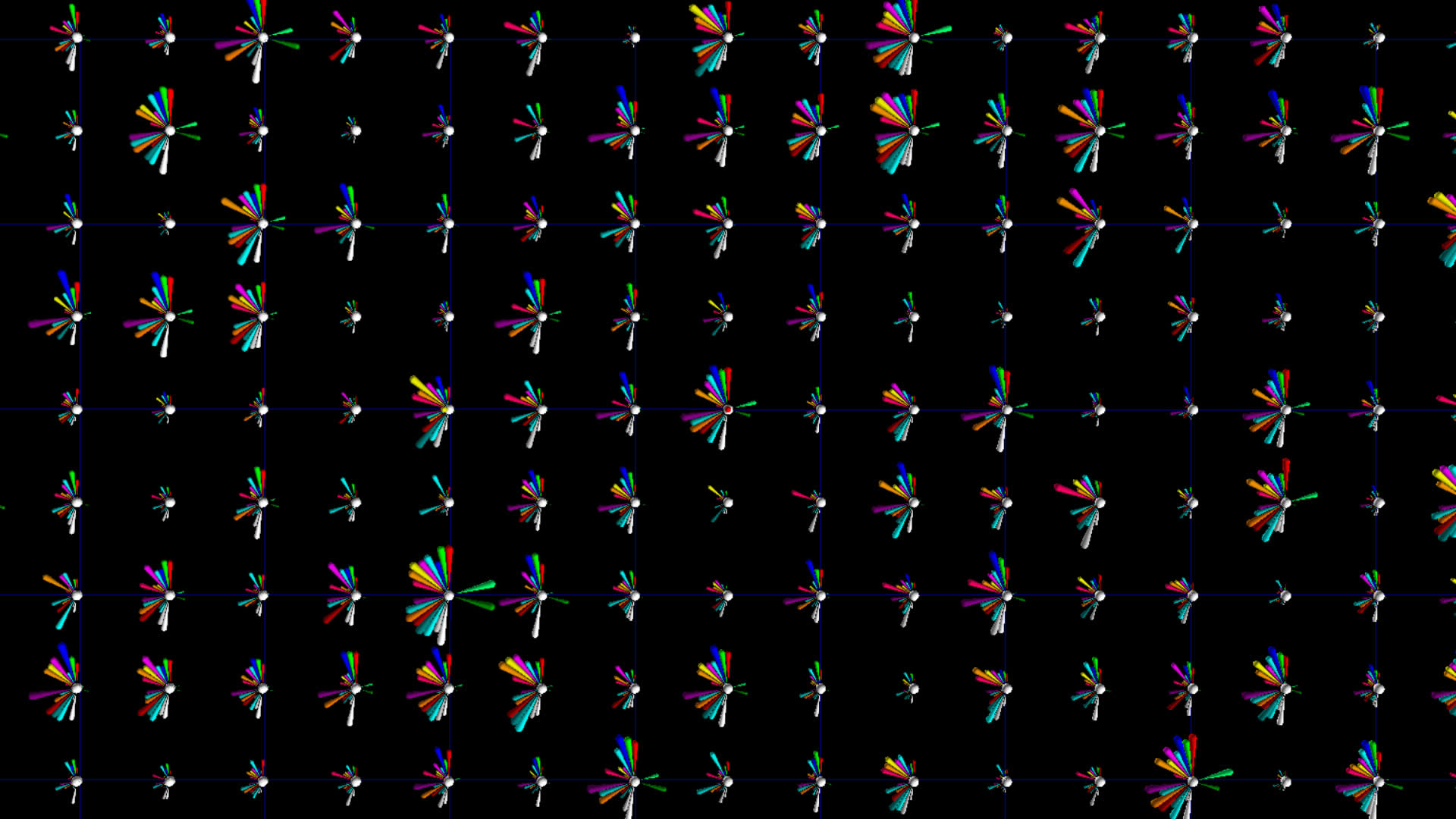
The image below shows a common feature in several glyphs from the #idlib top 1000 tweeters dataset which suggested that some parameters in the 'categories' object were equal to their equivalent in the display_scores object, but the display scores were from 0 to 5 and categories values were from 0 to 1. I noticed this early on and scaled the categories 5X to be in the same range, which helped lead to this observation. While this was not stated explicitly in the Botometer docs, I probably could have deduced it.
I have decided to retain the redundant information since it does not impact the performance too badly and it's possible the redundant information improves perception.
#idlib vs. #qanon
Download the #qanon visualization for Windows.
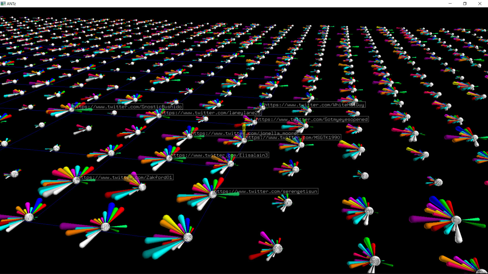
For the above #qanon dataset, if you select one of the central white spheres and hit the U key you will load the Twitter page for that account. If you have BotCheckMe installed you might find it interesting to see what they deduce compared to Botometer.
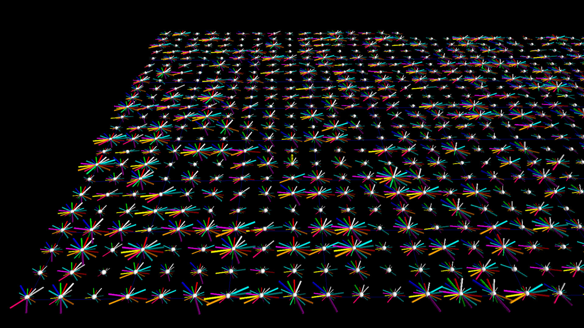
I thought it would be interesting to compare botometer data for two different datasets, one with a higher likelihood of bot-like behavior. I chose #idlid and #qanon, the latter be more likely to contain alot of bots.
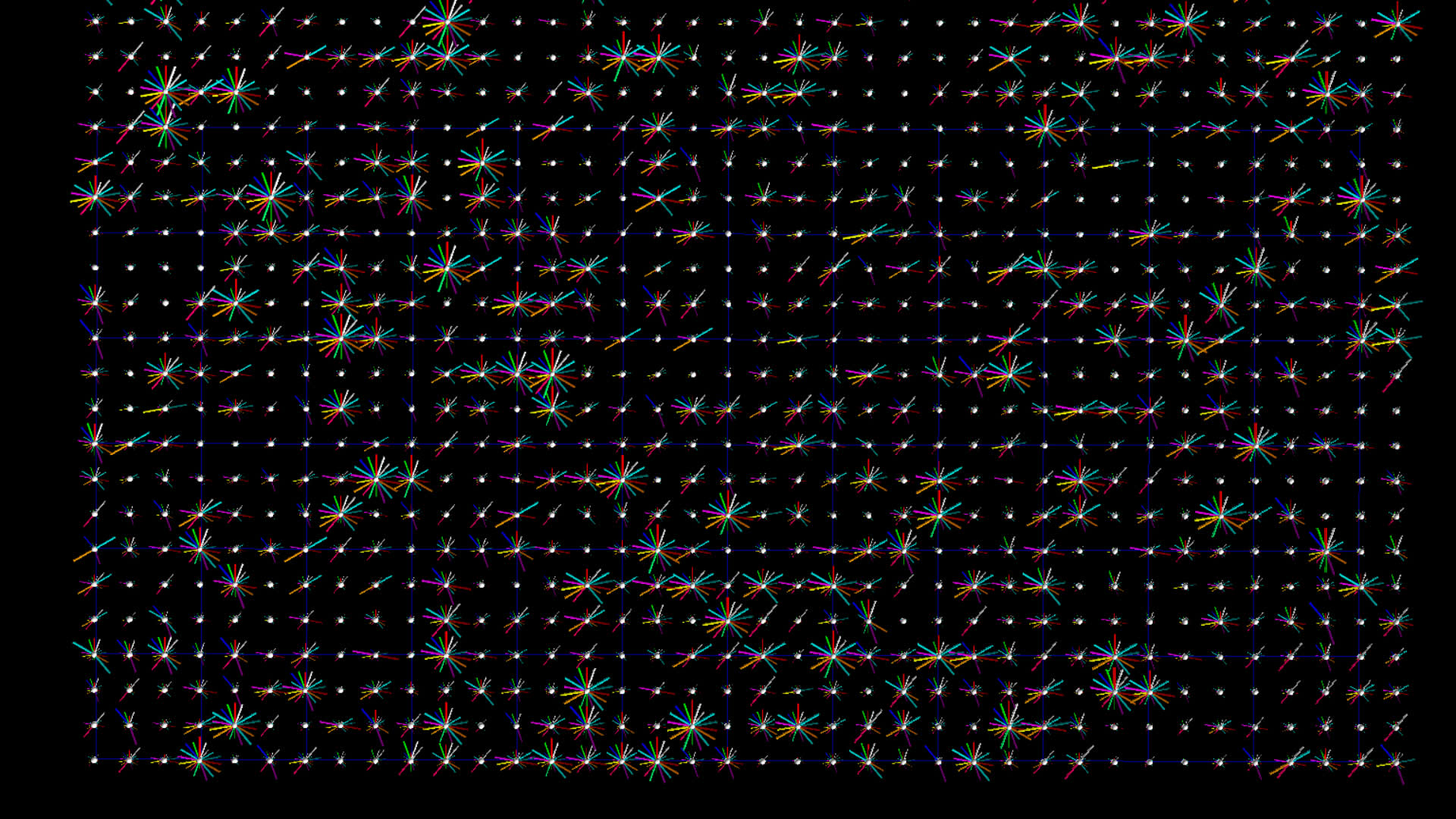
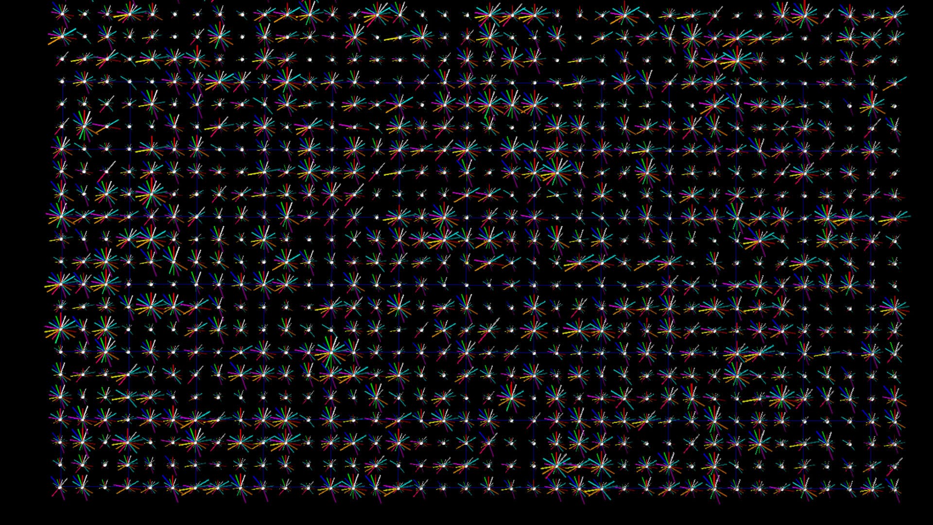
The images on the left below are botometer stars for the top 1000 tweeters from the #idlib dataset. The images on the right are the top 1000 tweeters from the #qanon dataset.
Version 2
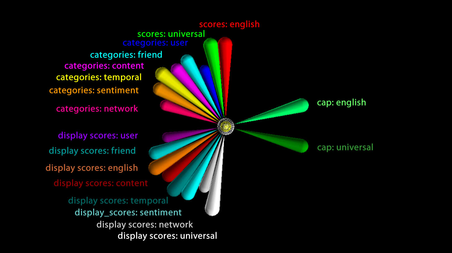
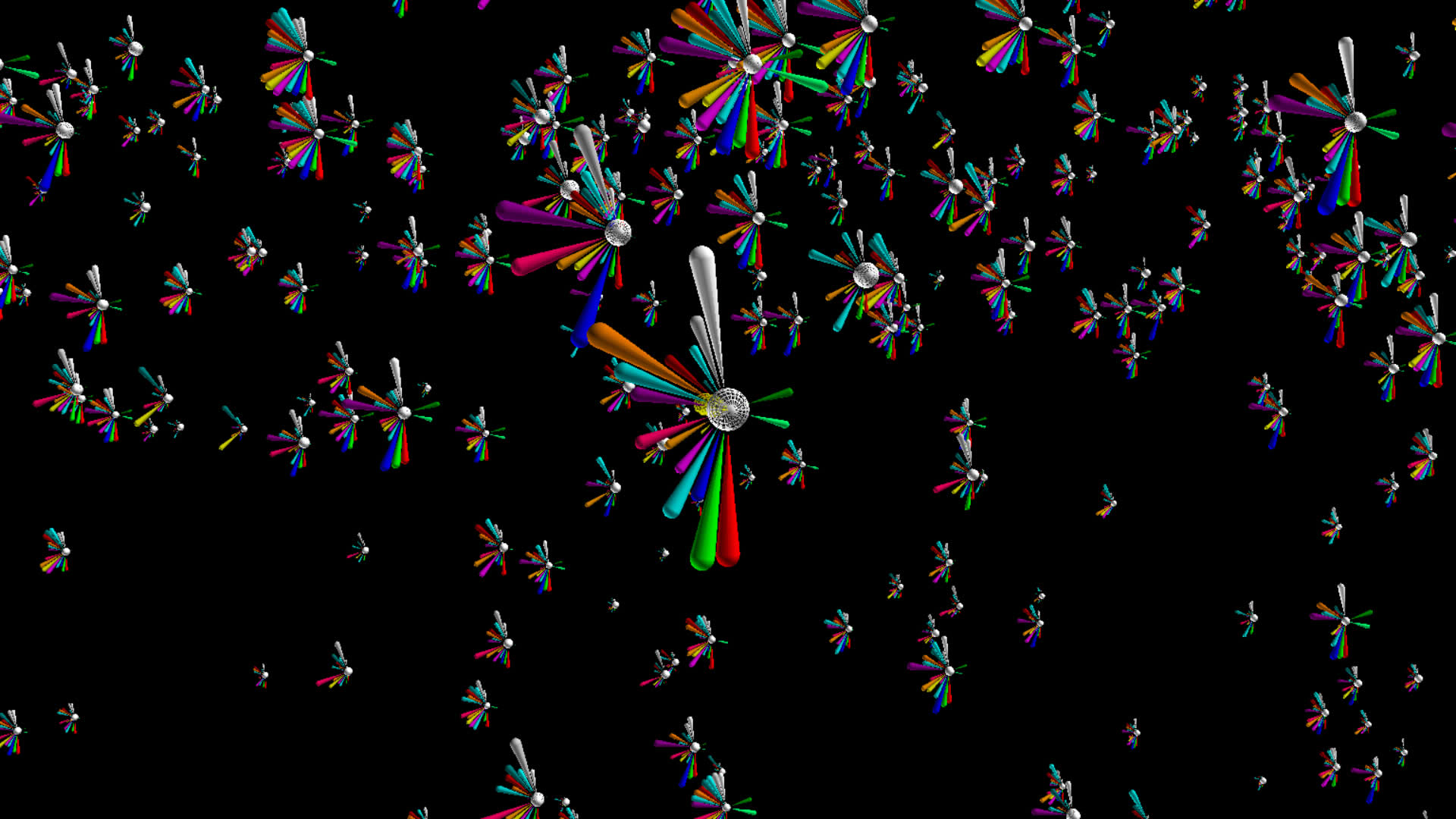
In the documentation for botometer there is a suggestion that the CAP value might provide a single measure of tendency towards complete automation, but you still need to determine whether to use the 'english' or the 'universal' measure depending on the language of the user. I figured why not just single out those two measures by rendering them separate from the other 16 measures. Finally, I had a BFO and changed the geometry from cylinder to pin in order to fill out, or make more prominent, the outer perimeter, sort of like a pie chart.
Sonification of Botometer Scores
Listen to a sonification of botometer scores.
Scatterplots
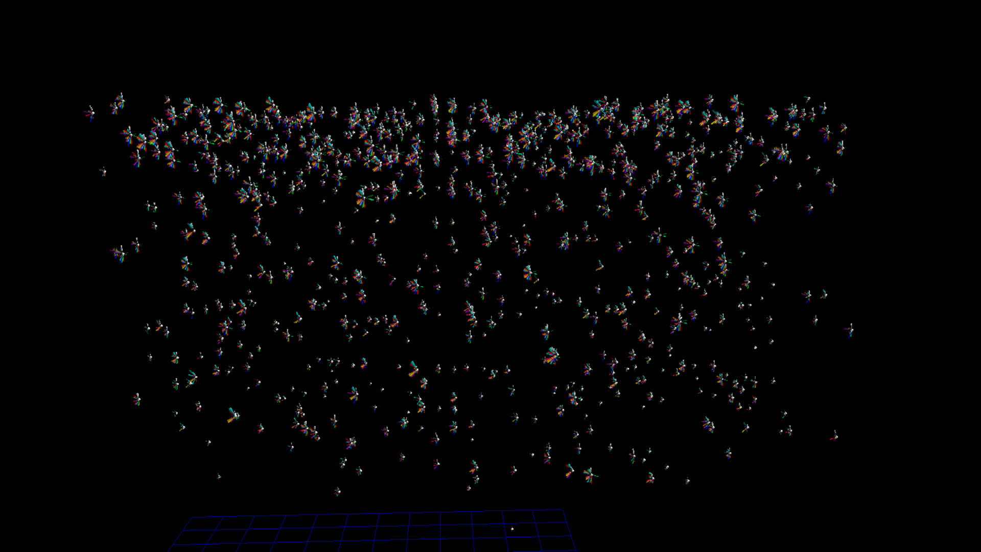
I then tried distributing the botometer star glyphs using the user account creation date for the vertical z displacement.
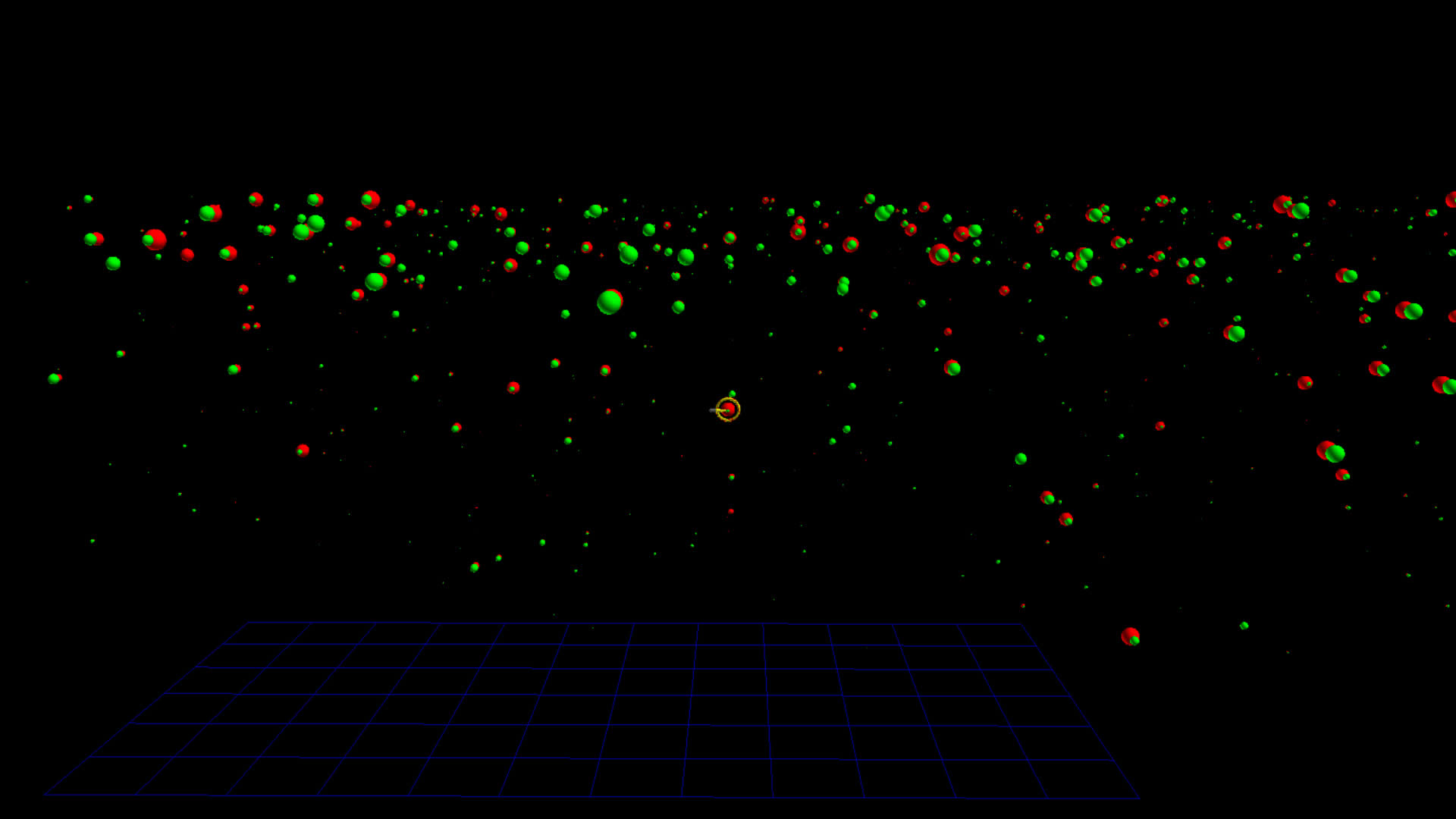
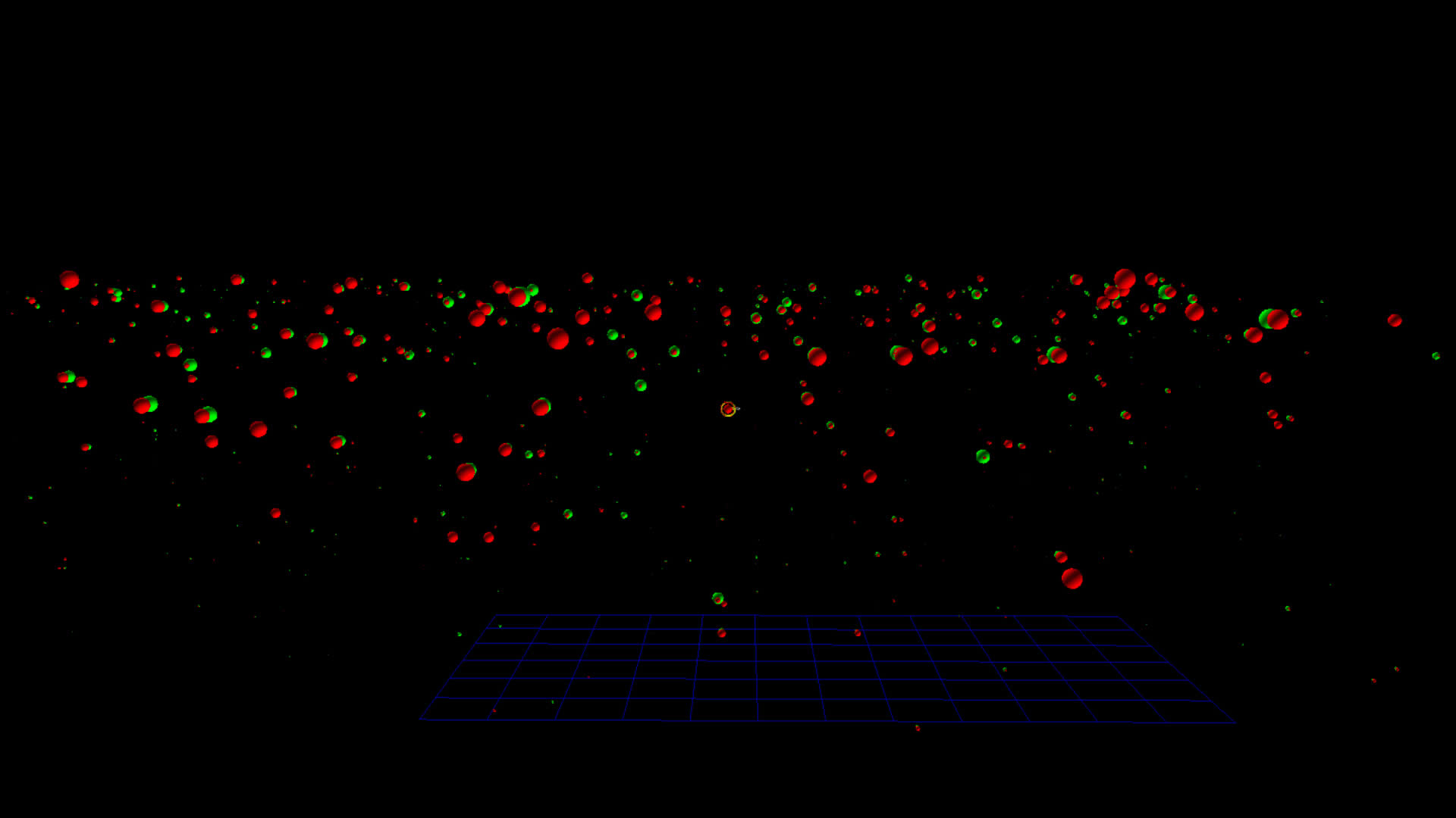
This approach seemed to border on too much information, so I simplified the glyph to include only the cap: english (red) and cap:universal (green) measures. I designed this so that when viewed from one side the english measure blocked the universal measure, and from the opposite side the opposite occurs.
